STORMY NIGHTS (during the day)

Shooting two TVC’s in one location is a great idea but especially challenging if each commercial require a completely different look, lighting wise. One look being bright, sunny, warm and soft, the other - dark, stormy, contrasty and…”realistically night time”. That last part always scares me - I’ll come back to that.

I co-shot this series of commercials with the very talented cinematographer Mark Kuilenburg, almost a year ago. It was our first time working together as a kind of gaffer/cinematographer/creative duo. I mention that because looking back, I guess I was trying to prove myself and make a good impression. We Recce’d, shot listed and planned this shoot together, but Mark left the lighting up to me and I was (now that I think about it) OVERLY confident in suggesting that we should shoot the night-time stuff…during the day.

“Yeah! We’ll just black the windows and throw a light through the front door!….DONE!”

Not only night time, but we also had to emulate lightening and rain on the windows, as if there was a storm outside. Nothing too crazy of course, but with a tiny crew and limited time it wasn’t a breezy setup. I’ll come back to that too….

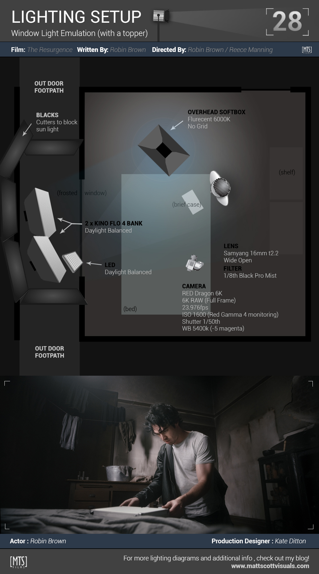
If you’ve ever caroused through my lighting setups over the years, you may have thought to yourself “who has the time, or the imagination to create a lighting set-up like this before a shoot?” And the answer is, not me. NONE of these setup’s were done - to that level of finesse - before a shoot. I might sketch a lighting plan on the back of a napkin after a recce, but it inevitably changes on the day. Just like this one did :) The diagram you see below is me spending hours creating little icons and basically designing a poster. It’s as accurate as I can do in Photoshop hehe…but hopefully gives you an idea of how I light stuff.

SO! Back to the “realistically night time” part. It scares me because often people have inaccurate ideas about how night scenes actually look on screen. Sure they can FEEL like night time, but there still needs to be light, and there’s often a LOT of it - especially for a TVC. The difference is that it’s well controlled and the ambient light is low. That, and the fundamental idea that the scene is at least “lit” by a practical. That could be a fire place, or a lamp, a TV, an iPad, headlights, or candles….which you can then enhance further with your own film lights, keep spill off the walls and create realistic lighting that makes it FEEL like night time. So, on this TVC? Nope. This shoot was written with the power-lines being down. No house or street power. They left me with the dreaded idea that MOON LIGHT would light the interior of the house. Oh, and a green tinted LED torch that was as bright as black hole.

Not only did I have to black out the entire front of the house (which was time consuming), but I also had to leave enough room on the porch to create “moonlight”, and please, no, don’t say it…..lightening. We all love a good rolling-shutter-half-screen lightening flash don’t we ;) That, and rain…on the porch, between the front window and the blacks…with the the lights and power cords. Safety second?

“Yeah! We’ll just black the windows and throw a light through the front door!….DONE!” I said. Fully knowing that I didn’t really have any idea of how I would go about pulling this off.

I often find that jumping into the deep end is the best way, for me anyway. Terrifying, but energizing and fun.

Meanwhile, when I speak with utter confidence, I am in fact…MOSTLY confident. I know that I’ll be able to create something okay, something that works, and as far as this shoot went, I was happy. In hindsight though, I reckon I could have gotten away with MORE light. Especially as a key on the dad’s face at the door. You’ll see in the below video tutorial that I ended up masking a fair bit of the walls off and lowering exposure to help with contrast. That’s the tricky thing with lighting for night, especially when there is supposed to be, no light. Even if you decided to key someone’s face using a small soft source, you’ve got spill to worry about. Same goes for any light that you chose to illuminate the scene with. Controlling the light in a small, dark house (with white walls) isn’t easy!

Shot_29_TasNetWorks_NIGHT.jpg

Lighting everything blue is a cheap trick that helps emulate night….even though it’s not necessarily accurate, it’s a good starting point. I pushed the blue further using 201 Blue gel’s on daylight sources and had the camera set to a white balance under daylight (in this case, 5000 Kelvin) which emphasizes it even more. I was careful however, not to gel EVERYTHING blue. Even with decent light/shadow contrast, the whole scene might look a little too flat if it were all blue, which is why I chose tungsten to light faces :) Meanwhile, setting the camera’s white balance to 5000K (instead of 3200K) warms the tungsten even more. The result is great colour contrast and effective separation of what is important to look at in the frame (faces). You can then play with that warmth (especially on skin) in post to get it looking right…same with the blue surrounds and how they work with each-other. You might also notice that with the side light on Ruby, I set the LED to 5600K without a blue gel. This added, although subtly, to the contrast of colour I’m talking about. Her hair is lit closer to white compared to the “moonlight” blue around her and it helps :)

And then, the lightening. I’m not sure if you’ve ever tried using a flash unit to create a lightening effect, or gun firing effect…because in theory, it sounds perfect! A super bright, controllable light flash that runs on batteries! In practice however, a rolling shutter (a shutter that scans in passes across the sensor from top to bottom) just doesn’t capture it well. Only part of the screen will be filled with the flash!

You’ll notice in the diagram that I’ve used a separate LED out on the porch, gelled purple. I then turned it on and off, just enough to create a flash which bounced through the windows and looked somewhat compelling (sound design helped of course, thank you George Goerss!). The challenge was though, that the LED doesn’t actually turn on instantly….it kinda builds up and then all of a sudden turns on, which made the timing of the flash really difficult. The inconstancy of that flash actually helped though I reckon :)

Finally, let me answer the questions that I know I’ll be asked:

1) What are the Godox lights like?

If you know me, you know I like cheap gear - comparatively cheap more specifically. Comparatively cheap and useful gear. It’s a risky business because it means investing in something that could potentially be a nightmare or a waste of money. These lights have been the workhorse for me for a couple of years now and I love them. I found them because I wanted to be able to modify my lights simpler and cheaper…which meant the tried and trusted, BOWENS mount. Modifiers are super cheap and there’s lots of them! Mostly made for flash units but work fine with these guys :) I even have true fresnel, focus-sable lenses for them!

2) How bright are they?

I haven’t tested them side by side anything, but from my experience, if you daylight balanced a 2K blondie… these are brighter. They’re also cooler, draw ten times less power and are simple to modify.

3) Do they have a colour cast?

Yes, magenta, but it’s minor and not a problem as far as I’m concerned.

4) What’s the fan noise like?

Three of them running at 100% intensity with the windows closed, close to the talent…yeah, it could be a problem, but otherwise, they’re fine. Nothing compared to a RED Scarlet-X.

4) Would I recommend them?

Yep.

5) How much do they cost?

Between $500 - $600 AUD.

6) Where can I buy them?

I got mine from an eBay seller (not direct) but that seller doesn’t exist any more. Meanwhile, they’re not hard to find if you google the shit out of Godox SL200W.

7) What about the other variants from Godox (the SL60 for example)?

I don’t know, I’ve never used any other godox products.

So, have you ever lit for night? What was your approach? I’d love to learn about other people’s experiences with lighting for night-scenes…I find them very difficult, but super fun :) In my next blog post on lighting (shot 30), I’ll be breaking down the same house lit completely differently. Here’s the TVC…

Posted on October 10, 2018 .

SOFT WINDOW LIGHT EMULATION

I know it's been a while...a damn long while...but hey, sometime's life is just fucked and you run out of steam, have nothing left to give and feel like disappearing for a while. No? Well...with that said, I feel like I've at least found some direction again and have some motivation for the first time in months. It's been a rough year. 

Anyway, I've already written about my experiences as DoP, Editor and Colourist on Robin Brown's film 'The Resurgence' a Pokemon fan film, many times...and I'm sure you're sick of that by now hehe...But every time I revisit a shot, it get's me excited and reminds me of the great experience that involved struggles and success, team work and all the other fun stuff that comes with filmmaking. I get asked a LOT to break down lighting from the teasers, so here's another shot below...one of my favorites.  

THE LOCATION

Before I get into my decision on lighting and all that, it's totally worth talking about how fucking amazing this location is / was, and the story behind it. It was our second scout day and Reece Manning (our Producer and Director) had tee'd up a meeting with the owners of a lovely town house on Johnston Street in Collingwood. "This place will be Ash's place" he said. As we made our way up the stairs to the second floor we all noticed the strong smokey / burning smell that filled the house, but didn't say anything...I had a quick peek around the corner and saw black marks on the wall and what looked like a burned door. I was excited already...but not for what I was about to see. We got to the actual room up stairs and I instantly didn't like it haha....sorry!! Why? Well, it was supposed to be a run down and abandoned shack but it looked so clean and perfect. I know production designer Kate Ditton would work her magic on the place but it wasn't just that.

The windows. When I visit locations I either stress out or fall in love - It's never in between. Mostly because I'm thinking about how the heck I'm going to light a scene and where I'm going to put my lights! Since our character Ash was supposed to be living in an abandoned hide-out style shack - I didn't want to have light motivation coming from practicals because practically he wouldn't have power! So that meant candles and windows. In this case, a single window. The problem was, it was two stories up! Our biggest light stand wouldn't get that high and it would require running power out onto the street, getting a permit, having someone mind the light/s and well, it just worried the shit out of me. So, I was solidly against the location...but as we all know, indie films means indie budgets which means beggars can't be choosers...so I kinda knew I'd have to make something work with what we had. Damn it!!!

With a long face I began walking back down the stairs. I couldn't help but take another peak inside what appeared to be 'the burned room'. Gently and slowly pushing the door open, I was gobsmacked and almost aroused but the sheer filth and burntiness of the place...."THIS IS IT!!!!" I said to the producer who eventually peered his head into the room. There was burned furniture, burnt old photos on a burned wall, melted glass and black shit everywhere. It was so perfect in my mind and it had A FROSTED FUCKING WINDOW, on the ground floor hehe :) Perfect. I enthusiastically started telling the guys how I would set up the room and how I would light it....

Okay so back to reality...the burnt room was left that way because the insurance assessors were yet to do their shit with it. It was basically a no go zone and in two weeks it would all be ripped down (sad face). Like a roller-coaster (welcome to my life) my mood dropped again and I was beginning to think of ways to light the upstairs room...I was so shattered!! With extreme pessimism our Producer told me that he would talk to the owners and see what he could do. I wasn't hopeful...not sure if I could take another dip on the roller-coaster hehe ;) To cut an already long blog post short, REECE GOT THE DAMN PLACE! We had to shift the shooting schedule but it was so worth it :) ANYWAY!!! Why mention all that? Because I haven't even started rambling on about how lighting is the most important aspect of cinematography. Remember lighting is what will set you apart - it's the magic behind any great shot...right!?!?!? Well, yes and no. If I had to light the upstairs room, even with Kate's magic...I KNOW it would NOT be a shot featured on the blog. My point is that location and production design make every cinematographer's job a lot easier. All I had to do was sprinkle some light onto what was already fucking SICK! Of course, I could still screw it up, and good lighting would still be important, but I wasn't stressed anymore, I was inspired. 

THE SETUP

Even though it was a bright day outside, the sun's intensity and direction was constantly changing. I had to somehow control that. Using black material and boards we did our best to block all of the lighting coming through the window. It was a tight fit between the window and the fence and we still had to squeeze lights in there too, but in the end we managed to cram 2 x Kino Flo (4 bank)'s and an Area 48 Soft LED into the space.       

Here's the blacks half done - thanks to Glen Cook for all the effort here...it wasn't an easy space to work in (and was the only access to the on set toilets!). 

So why Kino Flo? Why the extra little LED? My goal for this scene was to have a directional source, not a hard source. Why? I wanted NOT to make the light something you notice as a viewer. Sometimes a HMI smashing through a window just looks like a HMI smashing through a window hehe :) That's fine if your HMI is a 12K PAR with some distance and some warming filters...or you happen to have three 10K Tungsten's 20 meters away so that you can really give an idea of harsh sunlight coming from one direction....but we only had one 1.2K Fresnel, an old house circuit to power it AND it had to be up AGAINST the window due to the footpath and fence restrictions. The frosted windows were helping with diffusion anyway, but if I had thrown the 1.2K HMI, it would have been too punchy, too directional and too "oh I see you put a HMI through the window"....

Our alternative was the Kino's, even though slightly under powered for the exposure I needed (Tiffen Black Promist cuts nearly a full stop), they use fuck all power and produce a lovely soft light. Since Glen supplied us with two of them, I figured we'd use both and if we needed more light I could always reach for the LED...which is exactly what I ended up doing. 

A few tweaks to the position of the kino's and LED (using the outside wall as a cutter and shaper) and I was almost happy. I'm rarely ACTUALLY happy...not for very long anyway hehe...the shot just didn't have enough contrast. My hero of the frame wasn't popping as much as I'd like. Now, the hard part was lighting him but nothing else, and keeping my light soft...(I already liked the background exposure) so I decided to use my cheap-ass photography softbox's as a toppy soft light which would bring out the details in Ash's face and shoulders and help separate him from the background -  contrast :) 

I wrote in more detail about these lights in my previous lighting article HERE if you're interested.

You can see here what they look like and how they were rigged (C Stands with gobo arms). I only used one for the shot I'm detailing here, but we shot several scenes in this room and these bad boys were used in every setup. The grids on the softbox's help control the spill of the light so as not to light the walls...this is really important when trying to maintain contrast. It's kind of like grading the shot in camera (something you should be trying to do with your lighting anyway).  

A great way to assess your lighting is to look at each light separately. Systematically turn them on and off, building your scene, light by light. This can really help identify what each light is doing and gives you a very clear idea about what needs to be modified. Of course, it's best to look through your viewfinder when doing this, and that means that you'll be yelling across the set over everyone else who's trying to do their job...walkie-talkies are a good idea ;)

Although these crappy BTS shots don't show EXACTLY how the lighting was set, the below diagram does! 


During the rehearsal as I was looking through my viewfinder, I noticed a wonderful reflection that bounced off of the silver briefcase, filling in Robin's face for a moment as he placed it on the bed. I asked if he would be okay deliberately positioning it in a way that it would happen and he agreed - nailed it every time :)

THE CAMERA 

So what about my camera settings? Why 1600 ISO!?? Well, like I said I was about a stop under with my promist filter in front of the lens and I was really happy with my lighting - I didn't want to go messing with it now, besides, we were running out of time (as usual) so I upped the ISO instead. I normally rate RED at 800 ISO all day, every day (but sometimes 320 at night). I've been shooting with RED since 2011 and post processing it for just as long...this really gives me confidence when pushing exposure because I know what to expect. On top of that, I was shooting 6K Full Format - not to be confused with Full Frame - did you know that the RED Dragon 8K camera is THE ONLY RED CAMERA that can shoot 16:9 full frame with a 1:1 crop factor? RED ONE? Nope. RED Epic? Nope. RED Raven? Nope. RED HELIUM 8K? Nope. True story! Go and look for yourself :)

So, why would we shoot at 6K when we'll be delivering the film in 2K? One word (kind of two words)...Super-Sampling. I'll do a tutorial on that one day, but the short of it is, the more pixels you squish down into a smaller picture, the better...this means less noise (smaller noise pattern), better detail and of course the re-framing options you get later in post. This was actually quite useful for the featured shot because of the extreme lens distortion you get from a 16mm lens pointing up.

The other reason to shoot 6K on the RED Dragon (or use the full sensor on ANY RED camera) is because you ALMOST get full coverage on 35mm still's photography lenses. That's right...almost. RED Dragon at 6K FF (full format) gives you a 1.35x crop factor....which in the case of my Samyang 16mm lens is perfect. That lens is designed for an APS-C sensor which has a crop factor of around 1.6x...so on the Dragon....it JUST covers it...with some vignetting. 

I monitored the shot at 2000 ISO just so I could get a better idea of what Robin's face would look like (and to give my awesome focus puller Kate Tartsus an easier image to work with), but later processed it at 1600 ISO. Another interesting thing about shooting RAW on RED (or RAW with any camera) is that once you're in post, it doesn't actually matter what ISO you choose, the noise will be the same...another true story. I'll be covering a lot of this stuff in great detail when "GRADE MY SHIT" begins later this year. 

What about the white balance...why 5400K? Why not 5600K like my lights? Well, as you probably already know, your WB doesn't really matter that much when shooting RAW (because you can change it later without determent). I chose to monitor in at 5400K (with a slight pull on green to compensate for the fluro above) just because it looked closer to how I envisioned the grade...a little cooler :)  

Finally, the Tiffen Black Promist filter. What does it do? Apart from STEAL YOUR LIGHT!! hehe ;) It adds a slight (depending on what strength you chose) bloom to your highlights and can really help soften an image, without softening your pixels. They are a beautiful set of glass....and well worth the money my opinion. Of course, you can *almost* create the same look in post...but I just like doing as much as I can in camera.

THE GRADE

This part is coming. I'll do you guys a tutorial on how I graded this shot, but in the meantime, here's a couple of dicky wipe's from LOG to the final ;)

For that last shot above with Ash and Misty in the bed, the lighting setup was basically the same. The only difference is that I used both soft box's (overhead), a bounced tungsten LED from the left of frame (which you can seein the first BTS pic), and of course the HMI smashing through the window haha....I also changed the direction of the lights to come from the other side of the window (to emulate a different time of day). The grade above is not how the final film will look, but I liked the magenta hues in the shadows and how the skin constrasts nicely with the deep blue in the blanket.  

If you liked this article, please leave a comment! Or if you have any questions, leave them below and I'll do my best to answer them :) There are more lighting diagrams and breakdowns at the blog (27 more in fact!) so go check'm out if you're interested HERE


Posted on June 30, 2017 .

RED CLUB COLOUR CONTRAST [with budget overhead soft boxs]

Every now and then I like push myself and try something new when it comes to lighting (as if I'm not under enough pressure on set as it is hehe). As I clinically watch and dissect other people's films (ruining the enjoyment of actually WATCHING the movie), I get inspired to try and re-create certain looks...of course, within the boundaries of the film I'm shooting and how the story needs to be told. That being said, I've noticed that SO MANY of the frames I enjoy the lighting of seem to have a common ground....

Overhead Soft Sources....

So, cool...sounds simple enough right? Just place some overhead soft lights above your actors!? Yeah right. Simple! Did I mention that nearly ALL of the films I've shot have been lit with my small, cheap lighting kit? That which includes a single C-stand outside of the generic small light stands. Occasionally I'll have a budget to hire a HMI or two, but even then, I often don't have the cutters, frames or support I need to get the most out of them. My point is, I'm trying to recreate lighting styles that have had mega bucks behind them, without the mega bucks. I'm trying to set up lights with very little help in very little time, with very little planning, AND with the wrong equipment. I don't have any soft lights other than LED's (which I place diffusion paper in front of) and let's be honest, they're not REALLY soft...not like a soft box and they're rather heavy!

So what's the solution? The first thing I had to consider outside of the light source itself, was how to rig it. Do I purchase another large C-Stand? There's $300...and that's without a boom arm. Meanwhile, I'll need a couple more shot bags too. The problem is, how heavy will my light be and will a C-Stand safely boom it over my actors heads? "Safe" is not the word I would use if I rigged an 800w redhead plus a softbox, plus a grid over my actors heads using a boom arm on a C-stand with two shot bags. If that thing tipped over (which it will), it could do some serious damage.  

Then it was time to look at the light source it self - or more accurately, the light modifier (the soft box attachment) that would hopefully fit onto the front of my 650w fresnels. My first exploration into this world of soft light came from a studio shoot I did for Paul Nortan a while back (see the lighting setup here) where he had some generic softboxes attached to 800w redheads in his studio. I remember how hot those things got, and the burning smell that filled the room after about 20 minutes of them being turned on. It's always awkward when an actor asks about a burning smell...I just tell them there's nothing to worry about, other than a fire which could ignite at any moment. But of course, there are solutions to softboxing hot lights! Anyone got an absolute shit tonne of money? Me either. But if you do, check out CHIMERA's awesome kits! This medium sized one is designed to soften continuous tungsten lighting up to 2K. 

(the above prices were grabbed from their website August 15th, 2016) http://chimeralighting.com/ 

Cool, so a single soft box is going to cost me MORE than it did for my 2 x 300w and 2 x 650w tungsten fresnels!?!? No thanks. I'd rather buy another lighting kit, a new set of filters or some C-Stands. But then hey, I'm still left wondering how I'm going to try out this over-head soft source lighting! Alternatives? Yeah, I found a few, but they were still super expensive and I kept on having visions of a hot heavy lights tipping over and cracking heads.

So what if I tried some light-weight, super cheap and nasty, fluro photography softboxs that you can find on eBay for about USD$33 each?? They come WITH the lighting fixture included. That's right. How about THIS KIT for AUD$139?? Well, that's exactly what I purchased :) Now, before you post some shit like "The Chimera's are an awesome piece of kit and will last you a life time. Do it right, buy quality"...please don't, unless you're willing to sponsor my next shoot ;) 

Of course I was expecting colour accuracy to be low, and build quality to be lower. I wasn't wrong hehe :) If you've read any of my blog before, you'll know that that sort of thing never stopped me, and dare I say, never got in the way of great results. 

The lights arrived in about three days. Awesome. After a quick assembly and power on, I was more than happy with the light's output and quality at first glace. I then had to figure out how to gel them (for tungsten) and focus the spill (soft boxes go everywhere!). When speaking about costly lighting accessories, how about this roll of CTO? $79. it was the only "large" roll they had that would fit the boxes. Fuck. Okay, and the grids? Well, I got a larger one and cut it in half which really made life hell, but yeah, that cost $39 from Image Melbourne in Collingwood. That and the wire, gaffer tape and about three hours of my life...I think it was worth it....I think ;)

biggel.jpg

I wanted a design the lights so that I could easily (it hasn't been) add or remove diffusion, gels and the grid, all independently of each-other. I wired some lug type hooks to the skeleton of the box and well...it works....kind of. 

The hardest part was recreating an edge for the cut grid, and adding an additional flagging flaps to the edge of the box. I think I need to re-do them. As you can see, I didn't even bother flagging the edges of the second one, but I'll get around to it, when I can afford some more gaffer tape ;) 

So! Are they durable? No.

Light accuracy spot on? No way.

A perfect alternative to a tungsten softbox? Not even close.

Easy to transport, assemble and disassemble? HELL NO.

BUT!!!!

Do I now own a set of lights that are safe to boom over an actor's head, super soft, super bright, focused, almost tungsten, almost daylight, SUPER affordable and something I can learn with whilst achieving awesome results?

FUCK YES I DO.  

And let's be honest, a little DIY is always fun! I cannot wait to see how useful these babies will be on my next shoot! 


Meanwhile, back to the film that I shot using these for the first time. We'll get to the frame at the top of this post in a minute, but first take a look at some BTS shots of how I used them recently (both daylight and tungsten balanced). Oh, and we had 3 C-Stands on this shoot....what a luxury! 

And here's the result (with a wacky grade):

Below is another scene where I used them, this time daylight balanced.  

Obviously there is a lot more lighting going on than just the overheads, but man, let me tell you they are a treat to play with and I'm seriously loving the results :) ANYWAY! Back to the hero shot :)

The scene we're talking about has our hero character Ash (Robin Brown), desperate and on the edge, meeting in a club owned by a notoriously dangerous man. I wanted to keep the classy vibe of the club, but also keep it dark (make it darker). The club location we had access to was amazing. With lots of red around, myself and production designer Kate Ditton agreed to keep that colour strong and work with it. I had recently been inspired by the lighting in a film called The Forest (2016). Here's the only frame grab of the scene that I could find (shitty res I know), but at least you'll get an idea of what got me excited. Did I have this image on set? No. It was something that stuck in my mind though. Looking at it now, there's definitely some overhead soft source going on...right? Right. hehe ;) On a side note, Chinese lanterns are something I'm yet to play with....that will be another blog post I promise.

I'll often see some amazing lighting in a film and get all excited about trying to recreate it. The problem is though, sometimes I'm waiting for a month or more for the right job to come along (or any job at all). During those down times, I'll ring some friends and try to organize a small test shoot, or incorporate that test into a workshop. That way I'm building my lighting skill set and experience, and sharing that experience with others...it's awesome :)

Above is the lighting diagram and setup for the shot I got in the end.

First things first, I turned the house lights off. I then proceeded to place the overhead above the table, then filling the faces with the red bounce from the LED. I placed the other soft box on the floor for some soft fill and wrap for Jackson (middle). I switched all of the bulbs in that soft box off, except two and with the grid I wasn't too worried about losing contrast with spill lighting my background. So much easier than bouncing a 300w and trying to cut it!

The yellow flood (top right) was actually an existing light in the club, so I used it to my advantage and loved it! The 650w gelled teal (top left) was a choice I made to help with colour contrast. If I had left it tungsten or gelled it yellow or red, the subtle blues in the background wall paintings would have seemed off. I think the teal compliments that background colour, along with the blue in Dennis' shirt (right), the blue in the book, and also subtly gives Jackson (middle) an edge. All of that is then exaggerated by the smoke in the room from the cigarette and the pro-mist filter which ads a slight glow to the highlights. 

There was no room for our tripod to fit in that space and we didn't have a high-hat. This meant that I had to rest RED Dragon Weapon camera on my knees...not ideal, since it wasn't perfectly straight (I've had to fix that in post) and the frame moves ever so slightly throughout the scene. Meanwhile, the film is done and I'm lucky enough to be editing and grading it :) Cannot wait to share it! This scene is one of my favs :) There will be more lighting diagrams coming from this film, so stay tuned and thanks for visiting!

Matt

Posted on August 15, 2016 .

DAYLIGHT BALANCED TUNGSTEN (and clipping highlights)

Cinematic lighting is just code for lighting that has been designed to create focus and feeling. Designed, being the key word. In low budget scenarios, the designing freedom you have is limited, so, then it becomes 'designing with compromise' hehe ;) When planning or designing your lighting for any scene, it shouldn't purely be for purposes of illumination and exposure. You really should be thinking about WHAT is being illuminated, and by how much...these factors will direct your viewer's eyes to parts of the frame, so make sure you direct them precisely where you want them to look ;)

In the case above, I'm wanting the viewer to pay attention to our actor and his immediate focus. Of course the room he occupies is important, but it shouldn't be a focus. So, I lit the scene starting with a (somewhat toppy) backlight. I usually do that (especially when time is limited) because it's a quick way to create separation between your actor and the background, keeping in mind that the red curtain was already playing a part in that. I chose to balance the tungsten source to a daylight colour temperature, from 3200 kelvin to approximately 5600k using a CTB Gel. This would mean that the light's colour would match that coming from the window behind Reece. If I left it tungsten (3200K kelvin), it would appear orange on camera and become a focus in itself!  

The other role of this top-heavy backlight was to create a type of 'fill light' as it bounced off of the papers in front of Reece, illuminating his face (which would normally be in shadow). I could have used a separate light to achieve this also, but it would be difficult to shape and localize (keeping it off the walls), but more importantly than that it might have even began to look "lit". Using the paper instead of a second light created a more natural lighting situation - and saved me time.

To compliment and gently amplify this scenario, I added an over-head LED light, again balanced at 5600 kelvin to maintain the lighting colour temperature. As you can see below, I used a curtain to 'cut' the light, or stop it from illuminating the walls and only light the table. Again, this comes back to the question "what are you illuminating and where do you want your viewer to look?". The downwards facing light would also bounce off of the table and paper, helping with the exposure on Reece's face. I used two layers of diffusion in front of this light which would help it seem invisible to the viewer. I don't want the audience to think there is a soft light source above the table. Diffusion creates soft shadows and makes it difficult to notice a light's direction - exactly what I needed to boost my exposure somewhat, and give the table and it's contents a little more edge.

Finally, I wanted to add a smidge of exposure to the rest of the room. I keep mentioning that I try to design my lighting with focus and intent. Where do I want my viewers to be paying attention? Well, after lighting my focus point (the actor) with the backlight and paper bounce, I then looked at the over-all scene and considered the contrast ratio of the frame. Take a step back from the actor now...how does it looks as a whole? I felt that the room's ambient light needed a small boost and decided to 'warm' that boost up a bit by NOT balancing this light to daylight. 

To achieve this (as you can see in the BTS pic above) I had a 300w tungsten light (3200 Kelvin) shining into a white bounce board which was then illuminating the entire scene with a warm wash of soft light. This helped bring out some finer details that were previously lost in shadow.  

You may have noticed that the highlights on Reece's shirt are blown out, or 'clipped'. That is indeed true. Generally speaking, it's not a good idea to clip highlights in your scene. Why? Because essentially it means that you giving your viewer LESS information. A clipped highlight means that there is no detail in that area - it becomes a white mass of nothingness. In the case of Reece's shirt, the edges are clipped from the strongly focused backlight - this was a deliberate decision. As I experiment and break the "rules", I'm learning that it comes back to the same old question I keep repeating "What are you illuminating and where do you want your viewer to look?". Does it matter that you cannot see any detail in the window behind our actor? I don't think so. Does it matter that you cannot see detail on the highlights of his shirt? I don't think so. More importantly, are these over-exposed or 'clipped' areas distracting or deterring your viewer from looking where you want them to look? I don't think so....but then again, I don't REALLY know. The point is, I'm conscious of what I'm designing and experimenting at the same time. 


To see this shot in it's RAW, original recorded format, and to grade it yourself, I've added it to the DOWNLOADS section above. There's also a tutorial you can follow along with to see how I processed the image in Davinci Resolve if you're interested HERE.


I hope this lighting diagram and explanation has been useful! I'm always striving to learn new ways of lighting and experiment with different setups...hopefully you will be inspired to do the same. If you would like to be notified about future setups and diagrams or other tutorials and news, please subscribe using the form to the right :) There are many other lighting examples I've created in the LIGHTING section above. 

Happy shooting,

Matt

Posted on February 1, 2016 and filed under Lighting.

LARGE SOURCE TUNGSTEN LUXURY (plus a rad set build)

I write in more detail about my experiences on this film HERE if you're interested :) As for the lighting plan, the one immediately below shows what I was planning before I had seen the set...and then the detailed one below that is actually how I lit it.  Most of the shots for this scene were lit using this setup, with a few bounce cards and tweaks here and there.

This was my first time using such large sources, but I really enjoyed the control I had with them, and the ability NOT to shoot wide open at lower than usual ISO's (I normally shoot 800ISO on my RED, but shot this film at 320ISO because I could control my highlights easier). Also, a huge shout out to my dad for finally joining me on set and building an EPIC set....he's a gun! Let me know if you need a set built and I'll put you in touch with him :)

Above is a couple of shots of the ghetto soft box I had to make. Three layers of diff and some black cine-foil...the light wasn't as wrapping as I wanted (as large), but it did the job. 

For more lighting diagrams, please be sure to click on the LIGHTING section above! Thanks for visiting :)

Posted on October 23, 2015 .

SUPER STYLIZED MOON LIGHT (and how steadicam makes everything difficult)

A few moons ago, I shot two completely different films back to back, in the same location. This was the master mind idea of Director Jad Olivier who asked me if I would be interested in being his DoP. The compact but quirky shorts, written by Elezabeth H. Vu gave us a great backdrop to get creative with the lighting and cinematography. Although we didn't have a huge budget, we did have enough to hire some decent sized lights...although not enough to hire rigging equipment. I mention this because ideally, I would have liked to light this film from above - especially for the steadicam shot right in the middle of the film which spans across three rooms.

When shooting steadicam it's one thing to use it cleverly - slowly revealing information as the camera moves to help tell the story - but it's another thing to actually light the joint and make sure that the camera does not see the lights! I've been flying steadicam for a number of years now and often this is the biggest challenge. So, we had no option but to place all of the lights out doors and shine them through the windows. This actually worked in the films favour because it was set at night and the light coming through the windows was supposed to be moonlight...and that's what I mean by super stylized....it's pretty darn hard moonlight! That was the brief though, and in the end we were both happy with how it all turned out :) In fact, I love the look! Here's a frame grab of actress Simmone Duckmanton from early in the film.

Shooting that scene was relatively simple...I think that shot was a 35mm and the light on her face is coming from a 1.2K PAR HMI from out side (a long way away hehe). A lot of DoP's I know stay well clear of hard light, but I'm one to embrace it! It doesn't always work, but in this film I think we nailed it :)

Now it was time for the steadicam shot. Several rehearsals and a few lighting tweaks later, we got the actual shot in 11 takes. The problem with moving the camera is that so many more things can go wrong! Framing, focus, a light in shot, performances, a heard of moving crew, footsteps, bumps into walls, etc, etc, etc. Anyway, here's the shot and below is the lighting diagram. You'll notice my diagrams have been revamped! I probably won't go back and fix the old ones, but from now on, this is the new look :) Check out my icons! I designed them myself :) Dem pegs!!! hehe ;) 

And here's the diagram :) The new ones are even optimized to fit modern 1080p phone screens! Werrrrd.

I mentioned at the beginning of this article that Jad approached me about two films...the other shot is below....lighting diagram to follow soon :) Thanks for visiting and be sure to check out more diagrams at the LIGHTING section above. Cheers!


Posted on August 13, 2015 .

LOW QUALITY, HIGH EXPECTATIONS (cheap LEDs, affordable Fresnels)

Exceptional actress Courtnee Johnston above. Frame grab from TV pilot "Make Or Break", written and directed by Thomas Petrakos.

Exceptional actress Courtnee Johnston above. Frame grab from TV pilot "Make Or Break", written and directed by Thomas Petrakos.

It's not always about using cheap gear and shitty rigs, but of late it has been a topic that I've talked about a lot (CineSummit for example). On the majority of work that I get (Indy, self funded, negative budget) I often have no option but to use the gear I already own...which when it comes to lighting, is cheap and nasty ;) My LED's are about 3 years old and don't have a brand name - I purchased them from eBay/China. They aren't the best in the world and since I've compared to them Kino Celeb's for example and they really are shite haha...mostly in terms of light output and and colour accuracy. That being said, if you KNOW the shiteness, then you can work with the strengths and avoid the weeknesses, or at least know what to expect. For example, in the shot below (and in THIS SHOT), I've used my shitty LED's to great effect. My 500 LED that has dial-able "tungsten", is super green, but as you can see it works wonderfully as a hair light. 

As for my tungsten fresnels (please, please PLEASE don't embarrass yourself and pronounce Fresnel as "f-r-e-Z-n-e-l", the "S" is silent. Just say "f-r-e-n-e-l-l"), I've purchased the cheapest I could find, again from China (in this case from CAME TV, an eBay seller). For those of you who don't know the difference between a RED HEAD light and a Fresnel light, let me quickly explain.

"RED HEADs" and "BLONDEs" (often of 800W and 2000W - or 2K respectively) are both OPEN FACED lights, and both use tungsten (3200 Kelvin) bulbs. "Open Faced" meaning that the bulb is bare and does not have anything in front of it. The light spills out of the fixture which has a reflective background and resulting shadows are sharp. They are a great light source for filling a large area with uniform light. The downside to Open Faced Lights is that they are difficult to "shape". The only thing you have to shape your light are the barn doors, often used as cutters and useful for applying gels or diffusion with pegs.  

"FRESNELS" on the other hand are not Open Faced. They have a "fresnel" lens in front of the bulb and fixture. The fresnel lens is a very efficient tool for focussing a beam of light - much more so than a traditional magnifying glass. Check out this link to learn more about its creator and the lens's characteristics. Not only does the lens magnify the light (focussing or concentrating more of it into a smaller area), it also creates a much softer shadow compared to that of a bare bulbed open face source. My fresnels are of 350w and 650w variety, but you can get other varieties too - 150w for example, or 1K and 2K variants).  


So, getting back to budget and not having an arsenal of lighting equipment (or a gaffer's truck full of goodies), my lighting kit does NOT comprise of any open faced lights. Why? Because I find that I can pretty much do anything with a fresnel that I can with an open faced, plus I can SHAPE the light, control the beam and have more flexibility with a lower powered lamp, plus if I want hard light, the shadows are much nicer :) As you can see in the diagram below, I used a fresnel but bounced the light back into the actress's face so as to create a large soft source. 


A lot of my lighting diagrams are created months after a shoot, so I'm basically trying to remember the setup as best I can. That's not to say they are not accurate, but sometimes my camera settings have been slightly off (in a few cases, with White Balance). Now days I actually go back and look at the Meta-Data so I don't screw up, but sometimes you'll be looking at my diagrams and the resulting shot and think "those colour temps don't really make sense". I promise I'm not lying or making any of this up!! The results you see in the final shot have been coloured by myself in Resolve or EDIUS - meaning that I may have tweaked certain aspects of the colour to suit the outcome you see here.

Make Or Break screens in a couple of weeks...I'm almost done with the grade! I needed a break from it hence this blog post :) The one thing I've noticed about shooting AND grading a single project is that you can't blame the camera-man for screwing up (which I did many times here hehe). So frustrating! But it's all on me. That being said, it has strengthened the importance of matching lenses for colour and contrast (I'm going to test all of mine and create profiles for them in resolve, but that's another blog post). I guess that's one advantage of cine lenses I've never REALLY experienced. My lens kit is a mixed bag, and it's hurting now hehe ;) 

To learn more about how I light, be sure to visit the LIGHTING section above. There are 22 other's that I've shared and many more to come :) If you have any questions or comments, feel free to "DISQUS" them below! I've recent'y changed the commenting system on my blog to use DISQUS which is much, much better than the standard commenting system (I urge you to sign up to their service, it's free and is used on many forums and blogs). Thanks for visiting! 

Matt

Posted on July 6, 2015 .

ANY LED WILL DO (lighting with what you have)

I get at least 3 emails a week where people ask me "which brand of LED's do you use?", and "what is the CRI (colour accuracy) of your LED's?". Valid questions for sure, but unfortunately I don't know the answer to either of them. About two years ago I purchased three LED panels from an eBay seller that does not exist any more.  The specs were: "1000 LED panel, V-Lock" and another "1000 LED panel, Colour Temp Adjustable" (which really means 500 LED panel because it uses 500 for each spectrum - Tungsten(ish)Daylight(ish)). They were cheap and have served me very well as I strive to learn more about lighting. The fact that they run off V-Lock batteries meant that I could shoot out-doors with some success alsp. Getting back to my original point though...these LED's do NOT have a high CRI rating. The Daylight ones are magenta as hell and the "colour temp adjustable one's" tungsten is SO GREEN it's not funny. But, I've never had a director complain and I've never been disappointed with them either. I guess part of that comes from the fact that I mostly work on super low budget stuff, but also because I don't really have (or didn't when I purchased them) any other choice! Low power, soft source, relatively bright..SUPER CHEAP. That's all I know, and I take them on every shoot. 

Part of me agrees with snobby DOP's who complain/talk about NEVER shooting with low CRI LED's and how "awful" they render skin tones. Or how about suggesting that you couldn't possibly shoot food with LED's because the full spectrum just isn't there? Really!? I mean sure, when you're shooting the next Bond film, ask for the best and shoot with whatever you like, but don't NEVER do something just because it's not the ULTIMATE way to do it - that's far more dangerous than magenta spikes and skin tone rendition. That's putting a stop to actually getting out there and focusing on what you DO have and how best you can use it. 

Okay, so I'll stop the rant and get on with the show - just don't let anyone tell you NEVER to do something unless you've tried it before yourself....OR, do what I do and challenge the notion so that you can back it up with results ;)

Tomorrow is the last shoot day for Ryan Thomas's new short film 'Next Door's Mail' and I've really been enjoying the challenge of lighting the super tiny space we have to work in. I'm also enjoying the fact that the owner of the apartment, and lead actor (thanks Mitch!) has installed these funky Philips LED thingies that let you dial in any colour you want! The only problem is, you have to have them at 100% percent intensity otherwise they flicker, but they have really been awesome to play with. The fact that they hang on the wall by a rope means you can position them anywhere, the most flexible practical I've shot with that's for sure. 

Here's a close-up of Pete Young in one of the early scenes of the film. Not only have I been experimenting with lighting on this one but Ryan and I are also really trying to utilize clever, meaningful framing whilst keeping camera movement to a minimum. 

For more lighting setups be sure to check out the LIGHTING section above, or just click HERE. Thanks for visiting :)

Posted on May 2, 2015 .

OUTDOOR WRAP (and rain)

* For more info on this shoot, including behind the scenes pics, downloadable footage and other stuff, check out the blog post > HERE.     

Full clip here: https://vimeo.com/125872211

Shooting during an over-cast day is both a blessing and a curse. The blessing part is you've got a massive soft box above you, so light is even and shadows are soft and pleasant. The curse is that contrast is low and it's difficult to give shape to your subject without additional light. Since I didn't have any power at this location (or a budget for a generator), I was forced to use LEDs running of V-Locks. This was also a blessing and a curse! A blessing because shooting HFR stuff meant that I didn't have to worry about flicker (frame rates above 240 and well beyond are flicker free with LEDs), nor did I have to worry about anyone getting electrocuted since we were shooting in the rain. The curse was that my lights had to be relatively close to my subject in order for them to have any effect (competition with the sun is fierce), so many of my frames were limited to the the 75mm or 100mm, using tight compositions. 

The symmetrical "wrap" effect is a lighting set up that almost ALL movie poster shoot's employ. To be honest, it's a dirty trick that works every time...I love it! Not very realistic though and difficult to work into a scene from a movie when practicals and light motivation come into play, but perfect for that highly stylized shoot that needs a polished and commercial feel. The LED in the front could have been a little stronger (although I fixed that in post), but it's main job was to add a glimmering catch light to my subjects eyes. You'll noticed I warmed it up a little too, just to help with skin tones. 

It actually was raining that day too, but I found that the real rain wasn't dramatic enough. The larger droplets were something that took us a while to master when using the garden hose from the side-lines and really helped the shot in the end. 

Shooting slow motion almost ALWAYS looks good...so step up the game and try to make it look even better! Rain, dust, fire, anything with fine detail that we normally miss. I can't wait to play with 1000 or more frames per second! I've got some rad ideas brewing....might have to look at some 'Hive' lights. 

The model/actress you see featured in this shot is Simmone Duckmanton (www.helenpandos.com)

For more lighting diagrams be sure to click on the LIGHTING section above, or just go HERE :)

Posted on April 24, 2015 .

STUDIO GLAMOUR (using continuous lighting)

LEFT: Actor > Nick Soldatos RIGHT: Actor > Rosie Noone

In photography, the mind creates it's own story from a still image. It's a beautiful thing. In cinematography, it's not all that different (other than the obvious) because even though more of the story is being told with the addition of sound and movement,  the mind still tries to relate and associate what is happening on screen with its own experiences - distorting and fabricating it's own version of the film's story. That pesky mind....always doing it's own thing. Anyway, I love capturing images - moving or still. Photography and Cinematography both share one HUGE element of design, and that is...LIGHTING. in fact, I'd say that it's the single most important aspect of the two crafts....although lately I'm beginning to notice how important blocking and composition is when it comes to cinema...but that's another journey, and maybe it will have it's own blog section one day :) I should also mention, that on a shoot like this, MAKEUP is so damn important. We were lucky enough to be working with Maryana who did a stunning job :) Thanks Maryana! You absolutely nailed it :)

ANYWAY! As much as I love lighting and shooting as a cinematographer, there's something magical about stills that I'll never let go of. I really enjoyed this shoot! These images (and two more) will be used for a poster and promotional material for the up and coming TV pilot comedy, written and directed by Thomas Petrakos 'Make or Break'. 

Thomas and I talked about how we wanted the poster to look and quickly began Googling "Movie Poster" for inspiration. We decided that because of the nature of the show (comedy), we would go for a glossy, glamour look, rather than the moody, edgy and dark (teal and orange) posters you'll see if you Googled what we did :) This is the third studio style shoot that I've done (here's the one I shot before it). I don't have experience with flash units so I decided to stick with what I know - continuous lighting. After analysing some of the posters in our search results, I got an idea of how to light these portraits but let's be clear, I was only guessing! I didn't walk into that studio knowing exactly how to light it, nor did I know exactly how it would turn out, but what I am good at is being super critical of my own work, looking at it objectively and fixing what I don't like. Luckily, we had the day to shoot these four shots so I had time to make those changes...unlike a film set ;)

A big thanks to Matt from Barkly Street Studios for the great space, and my awesome crew Jessa Rose and Glen Cook :) I'll be sure to share the finished poster and other portraits when they're done. Thanks for visiting and if you'd like to see more lighting diagrams, please visit the LIGHTING section above, or just click HERE :)

Posted on February 26, 2015 .

REFLECTIONS ARE COOL (ask any photographer)

Creating depth is at the forefront of my mind when I look to compose any shot. How do you give depth to a 2 dimensional picture? We're not shooting stereo here, so what tricks can we employ to fool the mind into thinking this world (a flat screen) is somewhat similar to ours? 

There are a few. Depth of field as the name suggests, plays a huge role in , you guessed it, "depth". When one thing is blurry and another thing is sharp, our brains instantly start building a world that isn't flat any more. The space we had to shoot this scene wasn't exactly filled with objects or shapes that would help us perceive a difference in size (depth perception is also enhanced by this comparison), so I decided to use the mirror as a layer adding prop. With Rosie Noone's (amazing actress and joy to work with) shoulder's reflection left of frame, the image is beginning to shape up. The out of focus background element (actually, a reflector...it was a fashion shoot you know) helps carry this idea even further, because now there are three planes of focus, the middle one, Rosie, being "in" and the foreground and background ones, Rosie's shoulder and the reflector, being "out". 

To further sway this illusion of depth I decided to use colour contrast to separate these planes. Daylight balanced down lights illuminate our actress's (or is it PC to call everyone an "actor" these days?) while the un-balanced tungsten lamp from the rear warms up and gives edge to everything else. 

For more lighting diagrams, click on the LIGHTING link at the top of this page :) Thanks for visiting!

Posted on January 7, 2015 .

MIX DAT LIGHT (daylight, tungsten, halogen and LED)

Press the play button on the image above to see it in action :)

Mixing light temperatures can be risky, and I've rarely been happy when trying it in the past. I'll often have a rule, that mixing light temperatures is fine, so long as the "mixing" doesn't happen on the actors face. Sounds a bit crude doesn't it....oh well. The point is, usually, since you can only balance your camera to one white balance setting, or one Kelvin setting, if you have two different coloured lights illuminating someone's skin, it can often look yucky. That's right, yucky. For example, leaving the above tungsten practicals on in a home while the actor stand in the kitchen and daylight pours through the window, might not look as nice as if you turned those practicals off and just balanced for the daylight.

In this shot, I had a soft wash of daylight coming through the large window into the cafe and although it wasn't super dominant in terms of my exposure, it was playing a part in the overall ambience of the scene. I balanced my camera for that (5600K) and decided to use tungsten Fresnels instead of the 575w HMI's (daylight) to light the actor and the immediate scene, which would mean my camera would render tungsten light super warm, and the down lights, even warmer.  

Then there was the issue of the back, left hand corner of the hallway (camera left), which was in shadow. I could have also used another tungsten lamp to light that area (or simply left it in darkness) but I wanted emphasize the super saturated look and further compliment the colours already present in the scene. In this case, I loved the yellowish/greenish shirt pattern, especially how it played nicely with the red and blue background and already, overly warmed skin, and decided to turn my LED lamp to it's tungsten setting, fully knowing that LED tungsten (especially on cheaper LED's like the ones I own) have a green spike, which gets greener, the lower the intensity setting. 

The result is a greenish glowing back left hand corner, which separates nicely from the warmer foreground. Vibrant colours are everywhere, but not too distracting. With a smidge of diffusion (thanks to the Pro-Mist 1/8th filter in front of the lens) nice looking skin and dare I say, (although a little tight on headroom), what a simple, but beautifully composed shot. It always helps when the wardrobe department does an amazing job, along with the ridiculously charismatic actor in front of the camera - Jordan Holtam, an absolute pleasure to work with. Cheers!

For more lighting diagrams and breakdowns of shots, please check out the LIGHTING section at the top of the page. Thanks for visiting :)

Posted on January 6, 2015 .

MATCH LIGHT VERSION 2 (using a match as a key light)

* download this clip and grade it yourself! NEW to the DOWNLOADS section (above)

Earlier this year I was invited to Alsayegh Media in Dubai to share my knowledge with the crew about lighting, lensing and post production techniques. Marlo Espolong is heading the video department there and has a wonderful team of enthusiastic and talented people around him. On day three we covered lighting techniques for interviews, out door lighting and how to work with different lighting types (HMI's, Tungsten Fresnels, LED's, etc). The shot above shows what we came up with for the "Low Key" lighting class. One of the most important aspects of any lighting, is contrast. How bright are some areas compared to others? And let's not forget about colour contrast too, which is also very important. Here you can see a good example of both brightness contrast (light and shadow) and complimentary colour contrast (red and blue).

A big thanks to Amir (Miro Sedra) for modeling for us, he's not only a talented editor and producer, but was great subject matter too :) Check out the lighting diagram below to see how we lit this shot.

For more lighting diagrams, be sure to visit the LIGHTING section at the top of this page. Thanks for visiting :)

Posted on May 15, 2014 .

WARM ROMANCE ( with small light sources )

MatthewScott_BedroomScene_01.jpg

We didn't have a studio, so we used a small bedroom. The walls were all white which helped with bounce, but made decent contrast tough to achieve. By smashing a backlight from top right I at least had a strong edge separating the couple from the white background. I also let the top/back light flair the lens and in addition, had a broken glass filter in front of the lens which was being hit by a flashlight helping with extra flairs and adding to the mood :) You'll also notice that Olympia's face is being nicely illuminated by some bounce from Maurice's white singlet. All intentional of course ;)

MatthewScott_LIGHTINGSETUP_11.jpg

For more lighting setups, check out the LIGHTING section at the top of this page :)

Posted on February 13, 2014 .

300 FPS, GUNS & RAIN ( LED's are your best friend )

MatthewScott_RainScene_02.jpg

Have you ever shot with RED? It's a noisy camera, and at 800ISO in low light, it's already noisy (come at me RED fanboys!!!) Crop in to 2K and the noise patterns are even bigger and more noticeable. So, a slower shutter (1/300th instead of 180 degrees) doubled my light intensity and gave the rain drops a longer length...win WIN! You can read in more detail about the shoot HERE :)

MatthewScott_LIGHTINGSETUP_10.jpg

The shot below is basically the same lighting setup, but this was shot at 5K 60fps through my Nikkor 50 f1.4 at f2.

MatthewScott_RainScene_02b.jpg

For more lighting setups, check out the LIGHTING section at the top of this page :)

Posted on February 13, 2014 .

SAMYANG CINE - LOW LIGHT (emulating moonlight & key light with a match)

I recently purchased the very affordable "cine" lenses made by Samyang/Bower/Rokinon. I had read all the reviews I could find on-line, and nearly all of them said that these lenses weren't really useable wide-open. Please define "useable" hehe ;) Below are two videos that show what I did with them (the 16, 35 and 85) all wide open. They are amazing lenses, and very useable wide-open.

Both of the frames you see above I lit as per the lighting diagram below. I wanted to emulate moonlight and see if I could use a match as my only key-light source. Both videos are graded very differently. One, over-the-top saturated and the other quite the opposite :) The Hallway shots were lit virtually the same, one light outside the doorway, one inside adding a tiny glow to the hallway.

For more lighting setups, check out the LIGHTING section at the top of this page :)

Posted on November 19, 2013 .

DEAD THERAPY BASEMENT (mostly bounce)

This location was so awesome. Picture a basement, hidden underneath a prestigious school on the top of a hill. Actually, this property was used in the original Mad Max too! Mad!

When we first recce'd the spot with Lucas, Julie and the crew, I instantly fell in love with the walls, but more so what I could do with the lighting. There were two windows that had light streaming down from above, hitting the floor. I knew exactly what to do. Smash some HMI's down through the windows and try to use that as my main light source. I did end up bouncing it off reflectors laying on the ground, for some extra kick. In hindsight, I think I needed stronger HMI's (2.5K's) but hey, the 1.2's did okay :)  I wanted to keep the place kinda dark anyway and I think it worked well.

Here's the breakdown:  

With a fairly simply grade, the shot really comes alive! See below for a before and after. I was also experimenting with grading the 1080p ProRes file, instead of the original 4K R3D, just to see how far it could be pushed. It's definitely not as easy, but with a little time, it's no problem :) I graded this in EDIUS 7 Pro using 3 way, Curves, and a window.

For more lighting setups, check out the LIGHTING section at the top of this page :)

Posted on November 8, 2013 .